Clean and simple or CAS for short . Ya gotta love it. I love it so much I have decided to do a week of posts on it so here we go........
There are a few different descriptions of CAS cards. Some people see it as leaving a lot of open space, some see it as uncluttered, some see it as having very few layers. I think it is very personal to the designer if you think your card is clean and simple then that's what it is.............so there!!!!! lol.
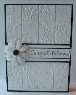
This card was made using the Secret Garden Embossing folder from Papermania, the XCut Scallop boarder punch and the petal posy decorative dies from XCut.
The base card is black. Cut the embossed white piece into 4 equal sections and mount onto white card leaving small gaps in between each section. Stamp your greeting on the right hand side of a piece of white card and then cut that piece long enough to fit over the width of your card. Mat and layer onto black, white and black again. Mount this section onto your card and then pop your flower on. I tend to use 3D gloss to stick the flower on as with the flower layers and the brad it is quite a heavy embellishment and the gloss just seems to make it rock solid on a card. :)
This is based on a card I saw a while ago on the web and I have been looking for the original card so I could give the credit to the original designer but have decided to give up searching for now as I am having no luck. If I find the designer I'll pop her blog link onto this post later on.
Happy Crafting everyone.


A fab card hun. I love the clean and simple style. well done xx
ReplyDeleteI love how you have cut the embossed piece into sections. It is a beautiful card. Bex xx
ReplyDeletegorgeous card!
ReplyDeleteBeautiful really pretty. Thank you for sharing
ReplyDeleteI love this. It's very elegant x
ReplyDeleteBeautiful card hun. Was great seeing you at Liffey, definitely best demonstrator ever xxx
ReplyDelete